Sveltekit Daisyui theme switcher

Install sveltekit
npm create svelte@latest .
Add tailwind using npx
npx svelte-add@latest tailwindcss
Install daisyui
npm i daisyui
Open tailwind.config.cjs and add daisyui by including this line inside the plugin array: require('daisyui')
The final code should look like this:
const config = {
  content: ["./src/**/*.{html,js,svelte,ts}"],
  theme: {
    extend: {},
  },
  plugins: [require("daisyui")],
};
module.exports = config;
Let's check the result in the browser
npm run dev -- --host
The website will use the dark or light theme based on your system's theme. This is the default behavior of DaisyUI.
To manually control or force this setting, open app.html and add data-theme attributes to the html tag:
<!DOCTYPE html>
<html lang="en" data-theme="dark">
  <!-- Rest of the code -->
</html>
or
<!DOCTYPE html>
<html lang="en" data-theme="light">
  <!-- Rest of the code -->
</html>
This way, you can have control over the website's theme.
Open the +page.svelte file under the routes directory and update the code
<input type="checkbox" value="dark" class="toggle theme-controller" />
I'm assuming you have set the
data-themevalue tolightinapp.html
Check the website, and you will notice that you can switch between the dark and light themes.
Open the tailwind.config.js file, and add the configuration for daisyui
/** @type {import('tailwindcss').Config}*/
const config = {
  content: ["./src/**/*.{html,js,svelte,ts}"],

  theme: {
    extend: {},
  },

  plugins: [require("daisyui")],

  // daisyUI config (optional - here are the default values)
  daisyui: {
    themes: true, // false: only light + dark | true: all themes | array: specific themes like this ["light", "dark", "cupcake"]
    darkTheme: "dark", // name of one of the included themes for dark mode
    base: true, // applies background color and foreground color for root element by default
    styled: true, // include daisyUI colors and design decisions for all components
    utils: true, // adds responsive and modifier utility classes
    prefix: "", // prefix for daisyUI classnames (components, modifiers and responsive class names. Not colors)
    logs: true, // Shows info about daisyUI version and used config in the console when building your CSS
    themeRoot: ":root", // The element that receives theme color CSS variables
  },
};

module.exports = config;
With this
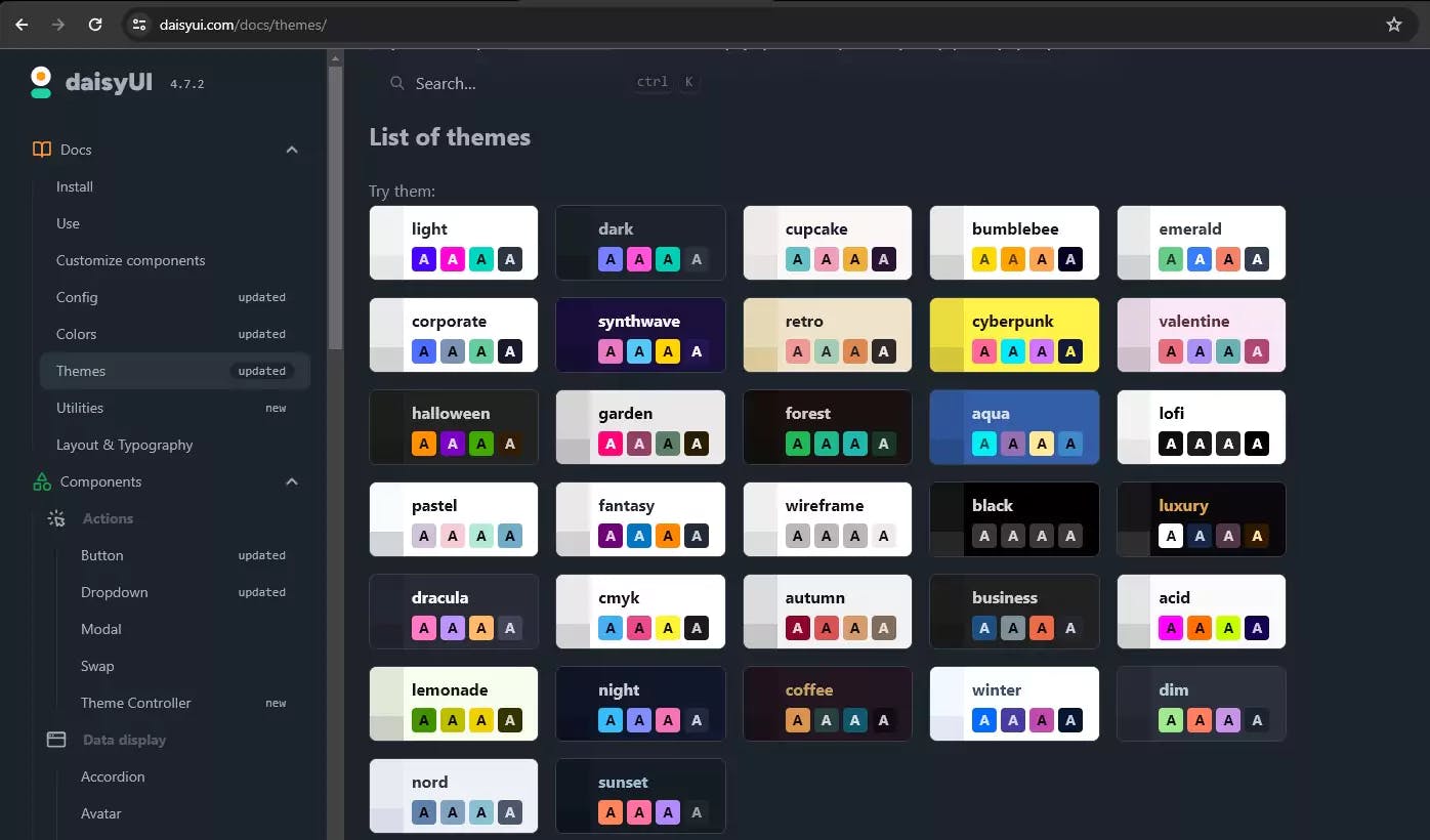
DaisyUIconfiguration, we can now use all the themes ofDaisyUI.
Let's check all the available themes of DaisyUI
Let's open the +page.svelte file again and change the value to forest
<input type="checkbox" value="forest" class="toggle theme-controller" />
Check your website, and you will notice that the theme switcher is now working.
With this method, you can switch between all the available themes of DaisyUI.

Struggle to choose between Shadcn svelte and daisyUI? Don't! This guide shows you how to install and configure both in SvelteKit for a powerful, flexible UI stack.

Learn how to implement robust search and a complete blog system in your custom Shopify theme using Liquid. The essential Part 2 guide

Improve caching and performance in SvelteKit by importing images from src/lib instead of static. Learn why and how this approach works.