Installing SvelteKit with shadcn-svelte & daisyUI Together


In the world of SvelteKit UI libraries, two giants often stand out: shadcn-svelte and daisyUI.
But what if you want the robust, accessible interactive components of shadcn (like Comboboxes and Datepickers) and the rapid layout classes of daisyUI?
Good news: You can use them together! 🎉
Follow this guide to set up the ultimate SvelteKit development environment. 👇
First things first, let's create a fresh SvelteKit project using the new CLI.
npx sv create ./Tip: Select the options that best fit your needs. We recommend using TypeScript for better type safety! 🛡️
To make our imports clean and tidy, let's set up some aliases in svelte.config.js. This allows us to use @ or other symbols to reference our directories.
Open svelte.config.js and add the alias object inside kit:
const config = {
  // ... other config
  kit: {
    // ... other config
    alias: {
      "@/*": "./src/lib/*", // 👈 This is a common convention
    },
  },
};jsconfig.json / tsconfig.jsonIf you want your IDE to be super smart about these paths, create or update jsconfig.json (or tsconfig.json if using TS) in your root directory:
{
  "compilerOptions": {
    "baseUrl": ".",
    "paths": {
      "$lib/*": ["src/lib/*"],
      "$routes/*": ["src/routes/*"],
      "@/*": ["src/lib/*"]
    }
  },
  "include": ["src"]
}Now, let's bring in the heavy hitter. Run the initialization command:
npx shadcn-svelte@latest initFollow the prompts:
src/app.css tailwind.config.js (or .ts) $lib/components $lib/utils shadcn-svelte uses Lucide for its beautiful icons. Let's make sure we have them.
npm install lucide-svelteLet's test our setup by adding a few essential components.
npx shadcn-svelte@latest add button input label cardNow, let's use them in a page! Create or edit src/routes/+page.svelte:
<script>
  import { Button } from "$lib/components/ui/button";
  import { Input } from "$lib/components/ui/input";
  import { Label } from "$lib/components/ui/label";
  import {
    Card,
    CardContent,
    CardHeader,
    CardTitle,
  } from "$lib/components/ui/card";
</script>

<section class="py-20 flex justify-center">
  <Card class="w-[350px]">
    <CardHeader>
      <CardTitle>Login</CardTitle>
    </CardHeader>
    <CardContent>
      <form class="grid w-full items-center gap-4">
        <div class="flex flex-col space-y-1.5">
          <label for="email">Email</label>
          <input id="email" placeholder="Enter your email" />
        </div>
        <button type="submit">Sign In</button>
      </form>
    </CardContent>
  </Card>
</section>We want our app to look great in both light and dark modes. We'll use mode-watcher to handle this effortlessly.
npm install mode-watchersrc/routes/+layout.svelte and add the <ModeWatcher /> component.<script>
import "./layout.css";
import { ModeWatcher } from "mode-watcher";
</script>
<ModeWatcher />
<slot /><script>
import Sun from "lucide-svelte/icons/sun";
import Moon from "lucide-svelte/icons/moon";
import { toggleMode } from "mode-watcher";
import { Button } from "$lib/components/ui/button";
</script>
<button on:click="{toggleMode}" variant="outline" size="icon">
<Sun
class="h-[1.2rem] w-[1.2rem] rotate-0 scale-100 transition-all dark:-rotate-90 dark:scale-0"
/>
<Moon
class="absolute h-[1.2rem] w-[1.2rem] rotate-90 scale-0 transition-all dark:rotate-0 dark:scale-100"
/>
<span class="sr-only">Toggle theme</span>
</button>Now, let's add daisyUI to the mix for those quick, beautiful pre-styled components.
npm i -D daisyui@latestlayout.css inside the routes folder, and import daisyui@import "tailwindcss";
@import "tw-animate-css";
@plugin 'daisyui';
/* rest of the code */Here is where things can get tricky.
class="dark" strategy on the HTML element. data-theme attribute. If you just run the app now, switching to dark mode might turn your shadcn components dark, but your daisyUI components might stay light (or vice versa)! 😱
The Fix: Use Tailwind's dark: variant!
Since shadcn-svelte (via mode-watcher) toggles the dark class on the html tag, we can simply use Tailwind's dark: modifier to adjust our daisyUI components. This avoids complex theme syncing scripts and keeps your logic clean.
Example:
<div class="card bg-base-100 dark:bg-slate-900 shadow-xl">
  <div class="card-body">
    <h2 class="card-title text-base-content dark:text-white">Shoes!</h2>
    <p class="text-base-content/70 dark:text-gray-300">
      If a dog chews shoes...
    </p>
    <div class="card-actions justify-end">
      <button class="btn btn-primary">Buy Now</button>
    </div>
  </div>
</div>
By adding classes like dark:bg-slate-900 or dark:text-white, you ensure your daisyUI components look perfect in dark mode while letting shadcn handle the actual toggle.
Perfect harmony! 🎶
Now you can use a daisyUI Hero section right next to a shadcn Form.
<div class="divider">DAISYUI</div>

<section class="pb-20">
  <div class="hero">
    <div class="hero-content text-center">
      <div class="max-w-md">
        <h1 class="text-5xl font-bold">Hello there</h1>
        <p class="py-6">
          Provident cupiditate voluptatem et in. Quaerat fugiat ut assumenda
          excepturi exercitationem quasi. In deleniti eaque aut repudiandae et a
          id nisi.
        </p>
        <button class="btn btn-primary">Get Started</button>
      </div>
    </div>
  </div>
</section>

<section class="flex justify-center bg-background pb-20">
  <div class="card bg-base-100 w-96 shadow-xl">
    <figure>
      <img
        src="https://img.daisyui.com/images/stock/photo-1606107557195-0e29a4b5b4aa.webp"
        alt="Shoes"
      />
    </figure>
    <div class="card-body dark:bg-gray-800">
      <h2 class="text-gray-300 dark:text-blue-300">Shoes!</h2>
      <p class="text-gray-400 dark:text-blue-300">
        If a dog chews shoes, whose shoes does he choose?
      </p>
      <div class="card-actions justify-end">
        <button class="btn btn-primary">Buy Now</button>
      </div>
    </div>
  </div>
</section>
You no longer have to compromise. By combining SvelteKit, shadcn-svelte, and daisyUI, you get the best of all worlds:
Happy Coding! 💻✨

The complete guide to running pgAdmin 4 Web in WSL. Learn how to install, configure, and connect to your PostgreSQL database directly from your Windows browser.

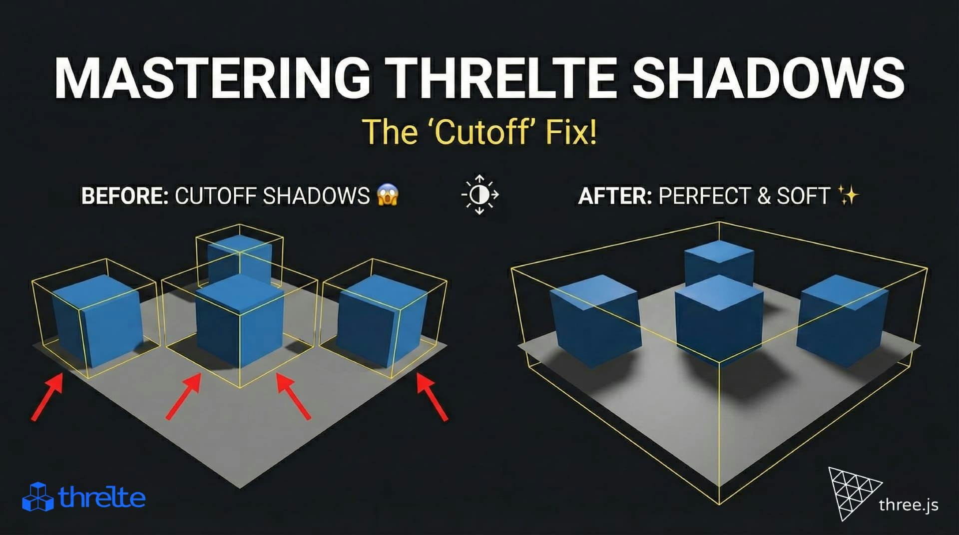
Shadows disappearing in your Threlte or Three.js scene? It’s a frustum issue. Learn how to visualize the shadow box and fix clipping instantly with this guide.

Confused by Shopify's lack of a database? 🤯 Learn how Shopify stores your theme data, from simple Settings to complex Metafields. Perfect for devs moving from WP/Laravel.